The purpose of color in nature is to attract attention – whether it’s a bird trying to find a mate or a beautiful flower that depends on creatures for propagation with its nectar and pollen. The same goes for brands on the shelf that are competing for your attention with vibrant colors and textures screaming “Pick Me! Pick Me!”
When it comes to printing color, you aren’t limited to the gamut you achieve with standard 4-color inks. Whether you call it six-color, high-fidelity, expanded gamut, or CMYKOG printing, this technique is known for producing more vibrant colors than a traditional CMYK setup. This is due to the addition of orange and green inks to cyan, magenta, yellow, and key inks (most often black).
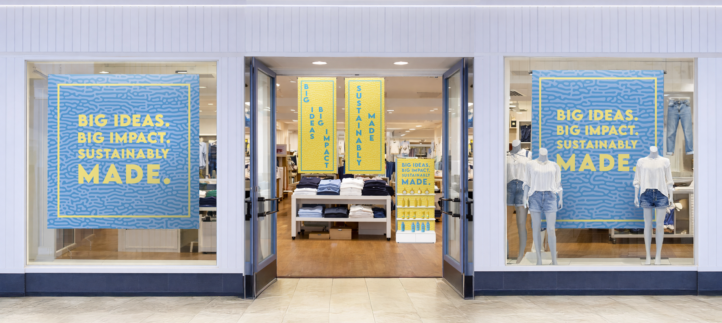
The addition of orange and green to this traditional set of inks broadens the range of possibilities, resulting in printed products that stand out more than a CMYK print. Social media has had a considerable influence on what colors and shades companies are using to build and maintain their brands. Vibrant colors are outperforming darker images and logos. Bright shades of orange, blue, and green are trending offline as well.
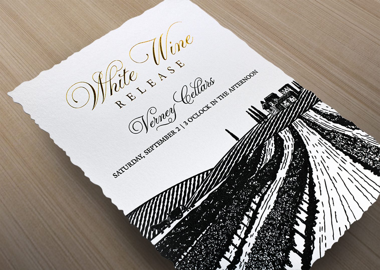
For example, take skincare startup Geltor. Its new rebrand uses bright colors inspired by nature to make its product packaging pop. Textures and colors are given new life on packaging that emphasizes the natural ingredients they use. Six-color printing is the key to an entire world of vibrant, eye-catching design with color.
Talk to Your Printer Early and Often
It is important to communicate early and often with your printer about what colors should be added to the printing process and how they can best optimize their use.
Knowing which paper is best for your colorful CMYKOG design is paramount. Using consistent well-formed paper, such as Monadnock’s Astrolite PC 100 uncoated and coated text and cover, paired with six-color inks, produce the best possible – and most sustainable – printed material.
Find Your Color Calling
Before you package up those art files for your next expanded gamut printing order, figure out which colors are important to your brand. Classic color combinations are a great place to start.
To take one example, orange’s complementary color is blue because they are across from each other on the color wheel. Six-color printing adds orange to the mix, making blues and oranges pair beautifully together and attract the eye.
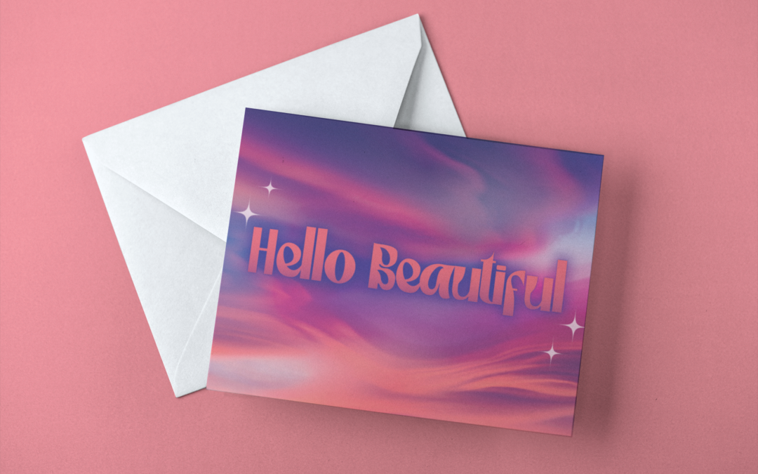
Green, on the other hand, pairs well with red. Six-color printing allows greens to be more rich, vibrant, and deep, bringing new life to shades of red when put together.
If you still need help establishing color combinations to make your printed product stand out, use this handy guide.
Ready to Make Ink Dance on Paper?
We have designed a new swatchbook with demonstrations to show you how it’s done. Request your Astrolite PC 100 swatchbook today to see, touch, and feel our uncoated and coated-two-side options for maximum contrast and image impact on your next project.