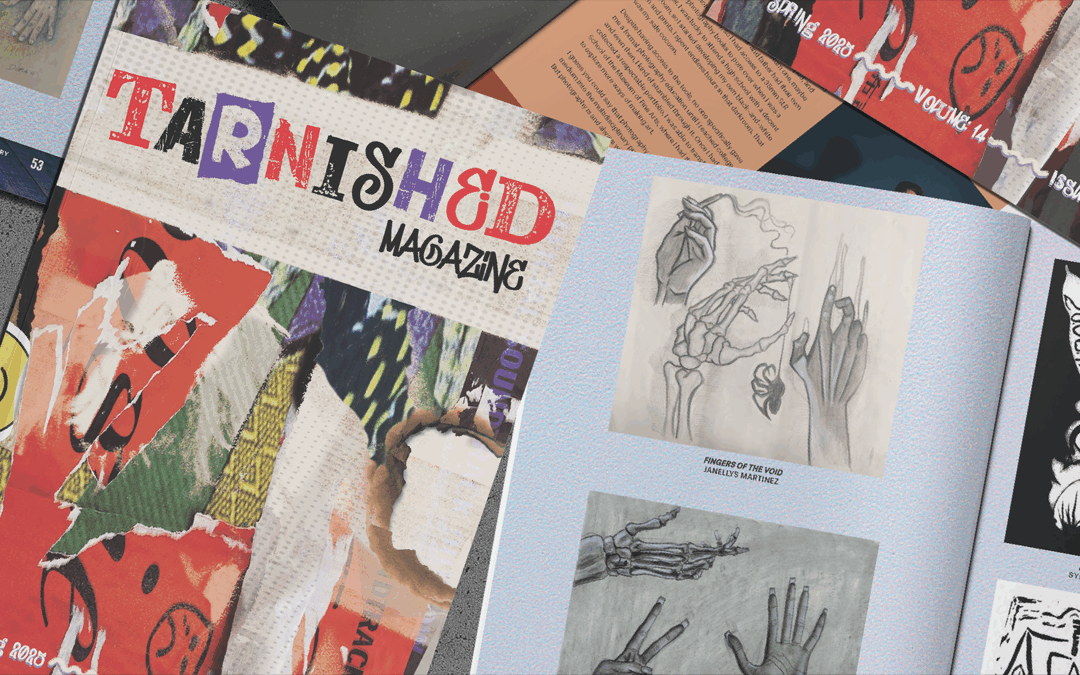
When Lasell University’s publication design students decided to launch Tarnished, they weren’t trying to create a perfect magazine. They were after something real – something raw, honest, and unapologetically crafted by hand. A publication that looked and felt like the people who built it.
Guided by Faculty Advisor and Assistant Professor Yvette Perullo Gattineri, Volume 14 of this annual student project unfolded as a bold invitation to reimagine what creativity could look and feel like, especially when it lives on paper.
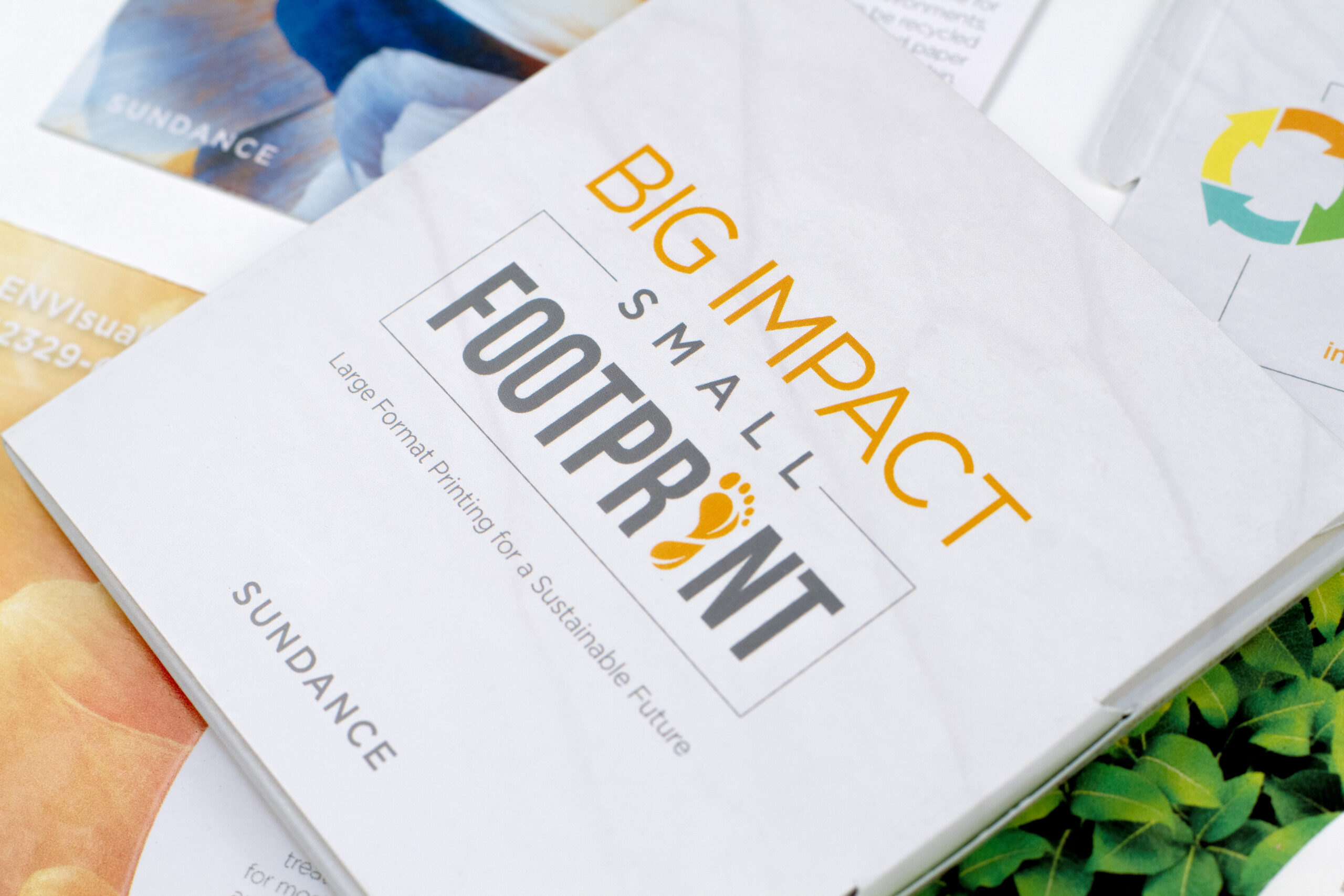
To carry the message of Tarnished, the paper had to do more than print well. It needed to embody the magazine’s values: authenticity, transparency, and craftsmanship. Monadnock Paper Mills’ Astrolite PC 100® and Astrolite PC 100® Velvet C2S, both made with 100% post-consumer waste fiber, offered exactly what the project needed: substance, sustainability, and a surface that holds up beautifully to rich, colorful imagery. Their integrity, both environmental and tactile, made them a natural choice for a magazine grounded in purpose and thoughtful craft.
The Power of Print in a Digital World
From the outset, Tarnished was more than a class project. It was a deeply intentional exercise in design thinking, sustainability, and material storytelling. As students move through concept development and layout, Gattineri encourages them to consider how paper could serve as an extension of their message.

That mindset carries through to the production phase. Gattineri guides students in preparing press-ready files, emphasizing fundamentals like resolution, crop marks, bleeds, and color conversion—details that often get skimmed over in digital design. “When students create something by hand, their skill level skyrockets,” she says. “Even if they never work in print again, designing for it sharpens their skills exponentially.”

For many of Gattineri’s students, Tarnished marked the first time they had experienced their work in print, or seen it translated from screen to page, from concept to final print. “There’s something transformative about holding something you created,” she says. “The sense of pride and ownership is tough to replicate in digital work.”
Although the hope is to one day bring printing on-site, this year’s issue was brought to life beautifully through a collaboration with Superior Packaging and Finishing in nearby Braintree, MA. Partnering with a local printer not only reduced the project’s environmental footprint but also provided students with hands-on exposure to the professional production process, from prepress to final delivery.
Paper Choice: A Material Expression of Meaning
For a magazine that celebrates raw expression and honest storytelling, the paper had to be more than a backdrop, it had to carry weight, both literally and creatively. With deep, layered imagery and bold color applications, Tarnished required a material that could support heavy ink coverage while preserving detail and vibrancy.
That level of performance—and the feel to match—was found in Monadnock’s Astrolite PC100®, an uncoated, 100% PCW paper with a clean, bright surface that handled the demanding ink requirements of the magazine with ease, preserving sharpness, contrast, and tonal range throughout.
“I overheard so many positive and enthusiastic comments about the color vibrancy, the texture of the papers, and the way the magazine felt,” shared Gattineri. “It’s uncoated and authentic in a way that mirrors the contents of the magazine itself.”
The cover, printed on Astrolite PC100 Velvet C2S with Soft Touch film lamination, immediately drew people in with its soft texture and rich feel. Erin Tilley, Art Director for Tarnished reflected on the unboxing of the newly printed copies: “I’ve watched people ‘oohing’ and ‘ahhing’ while feeling the silky matte cover paper in their hands upon first touch. The paper quality enhances the students’ hard work into an outstanding experience you can hold in your hands.”
That sensory experience—carefully considered and intentionally designed—left a lasting impression. At the launch party, students, faculty, and guests responded not just to the content, but to the feel of the publication itself.

“I’m extremely happy about how the issue came out, and grateful to Monadnock for donating the paper to us!” notes Aaliyah Wyman, Art Editor for Tarnished. “Seeing the work my team and I spent months on, beautifully printed on premium paper, really highlights how much we care and what we set out to showcase.”
Sustainable by Design
Earlier in her career, while designing political print campaigns, Gattineri saw firsthand just how wasteful the industry could be. “We printed in huge quantities with no thought about recyclability,” she says. “The day I saw one of my designs on the ground as litter, I was horrified. That was my work. Then boxes of extras arrived, hundreds of pieces no one would ever use. That was the moment I knew I had to approach design differently.”
Today, that mindset shapes how she teaches. Her students are encouraged to think about the full lifecycle of their designs, from sourcing and production to disposal and reuse. “Paper isn’t just paper,” she says. “It’s a reflection of your priorities.”

Astrolite PC100, Monadnock’s sustainably made, FSC-certified paper, aligned with both the concept of Tarnished and Gattineri’s commitment to responsible design. “Design decisions ripple out,” she says. “When students start to see that their materials and print partners are part of the story they’re telling, it changes how they think. It makes them better designers.”
“Sustainability is extremely important to consider when creating a printed magazine,” said Tilley. “Monadnock’s generosity and focus on sustainability have been truly amazing and have greatly minimized the environmental impact of Tarnished.”
A Partnership that Reflects the Mission
Tarnished stands as a clear example of what happens when design is guided by intention–when students are empowered to think critically, work sustainably, and create with care. Backed by Monadnock’s responsibly made paper, the project became a tangible reflection of the values it set out to express.
The partnership reflected a shared belief in craft, sustainability, and the lasting power of print. It showed students that every choice, from concept to material, shapes not only what we make, but what it means.
And maybe that’s the most important design lesson of all.

Magazine photography by Bruce Wahl, Instructor of Photography at Lasell University (@bruceofbruce). The cover photography and design were an assignment in Bruce’s class, “Photography for Design.”
Cover design by graphic design student Anthony Stancato (’25)