From Screen to Print: Understanding the Power of Paper in Design
When it comes to designing for print, selecting the right paper isn’t just a pivotal decision; it’s an art. With every choice, designers weave a story, setting the tone for how a brand communicates visually. Paper selection transcends aesthetics; it communicates brand values and impacts the overall visual and functional aspects of printed materials. The type of paper chosen can influence how an audience perceives a company with considerations such as readability, environmental impact, and budget constraints also playing key roles.
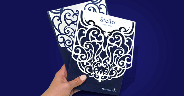
To break it all down, we recently connected with Jenny Hamilton, Owner & Brand Design Director at Blossom Creative, who provided us with a behind-the-scenes look at her creative process and shed light on the often underestimated role of paper in print design. She’s also the visionary designer behind Monadnock’s swatch books and printed pieces.
“Monadnock has played an integral role in my journey as a designer,” says Jenny. “Our partnership over the last 16 years has been a dream – they are true collaborators with a clear sustainability mission, an unwavering dedication to fine printing, and an appreciation for artistic expression.”

Meet Jenny
With a BFA in Visual Design and Letterform from the University of Massachusetts Dartmouth and over 15 years of experience crafting brand touch points, Jenny’s approach is personal and thoughtful, blending her artistic vision with a deep understanding of her clients’ identities. Her projects range from rebranding initiatives for established companies and nonprofits, to designing visual identities for small businesses and startups. Her expertise extends from logo and brand asset creation to print collateral, product packaging, and digital design.
Paper as an Extension of a Brand
“Think of a company’s printed collateral as a tactile extension of their brand,” Jenny advises. “It’s a sensory handshake, introducing the company’s ethos through texture, weight, and finish, which is why it’s so important to make intentional material choices.” So begs the question: How does a company want to be perceived by its consumer base? Companies known for their premium products should have marketing materials that reflect that premium quality. In these types of circumstances, Jenny often opts for a heavy weight, super-smooth, uncoated stock to drive home the message of high quality.
For sustainability-focused clients, the selection of paper goes beyond aesthetics – Jenny recommends paper with greater tactile depth, like Monadnock’s Astrolite PC 100®, which offers a premium feel with 100 percent post-consumer waste (PCW) recycled fiber that boasts superior formation and uniformity. The smooth and natural feel, along with subtle imperfections, not only enhance the paper’s sensory appeal but also communicate the material’s simplicity and the company’s commitment to sustainability. When printing on uncoated Monadnock papers, Jenny always recommends using an overall dull or matte aqueous coating. “The aqueous coating does not turn an uncoated paper into a coated paper,” she says. “Rather, it serves as a protective barrier to reduce scuffing and ink rub-off that can occur if a coating is not used.”
Another of Monadnock’s sustainability-forward papers is the Astrolite PC 100® Velvet. It has the same environmental credentials as Astrolite PC 100, but delivers a luxuriously tactile, velvety coated finish without compromising on environmental footprint. Not only is Astrolite PC 100 Velvet offset printable, but its universal coating is 3-star certified for HP Indigo presses, which makes it a great option for smaller runs or variable data projects.
In applications where durability is paramount, Jenny suggests coated stock for its resilience and longevity – making it an ideal choice for items like brochures that may spend considerable time on shelves, get passed around through many hands, or are sent through the mail. It’s also easier for printers to achieve more vibrant color on coated papers because the ink lays on top of the sheet rather than absorbing deeper into the sheet, so coated stock is often the default choice.
Printing for Perfection
There’s another important, yet often underutilized player to consider in the design process: the printer. The dance between design and print is intricate, and involving a printer early in the design process will help to achieve the most successful end results. Investing in a quality printer means partnering with a maestro who ensures each print note hits perfectly, from pre-press image preparation, to color fidelity and structural integrity.
While high-end printers may come with a higher price tag, their expertise transcends cost. A reputable printer possesses the know-how to effectively handle various paper types, especially crucial when mastering the intricacies of printing on uncoated sheets, where ink absorption varies. An experienced printer maintains distinct color profiles for each paper, ensuring accurate color reproduction and preventing issues like muddy images and dull color. Printing on uncoated paper is truly an art form.
“When vetting printers, requesting samples is a key step,” Jenny advises. “Printers send samples of their finest work in order to get new business, so if the preliminary samples are not up to par, it’s not a good sign.”
Even if a printer is unfamiliar with niche paper brands like Monadnock, they should be able to leverage their experience with premium materials to offer educated recommendations. Inquiring about final weight, folding methods, and their other professional opinions will also help gauge whether a printer is a good fit for a particular project. Monadnock is also an invaluable resource for printers, offering expert guidance on their diverse product offerings. Well-versed in the nuances of working with various paper types, they will happily provide knowledgeable assistance to printers navigating the intricacies of their materials.
Final Thoughts
When we asked Jenny about her typical go-to paper, she did not hesitate to answer: “Monadnock’s Astrolite Silk is my absolute favorite,” she says. “Its luxurious silky smoothness gives it the polished appearance of a matte coated sheet despite being uncoated, and its vibrant color reproduction and tactile richness make it a versatile option for so many applications.”
Astrolite Silk also proves the most forgiving in terms of printability for an uncoated sheet. Because of its superior surface uniformity, it performs much like a coated sheet on press, where the ink doesn’t absorb into the paper as deeply as other uncoated sheets, resulting in more vibrant color.
To the future Picassos of print design: Remember, your canvas – the paper – is a silent narrator in your design tale. It speaks in textures and hues, playing a crucial role in bringing your visual symphony to life. Through Jenny’s insights, we gain a deeper appreciation for the artistry involved in selecting the right paper—one that harmonizes with the brand, captivates the audience, and elevates the design to a realm of its own.