1 Communication
Open communication with a qualified print vendor is a great first strategy for excellent printed results. With early involvement, a print vendor can offer logistical advice in your planning process and potentially save you money and headaches, while helping to ensure beautiful results. Be sure to request printed samples on uncoated papers and ask questions.
2 Artwork
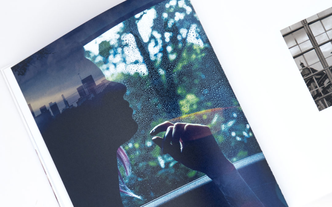
Because ink on paper doesn’t have the tonal range of original artwork, photographic film, or digitally rendered images, some tonal compression is inevitable; with compression comes the loss of detail. By working with a high-quality, higher-resolution original (within the range of the lithographic process), you will get results that meet or exceed your expectations.
Note: Some printers prefer that you leave your images in RGB instead of converting them to CMYK. Consult with your printer before preparing your files.
3 Color Curves
Dot gain is inevitable in printing on uncoated papers. Monadnock’s high-quality papers, however, have a surface and formation optimized for fidelity in image reproduction. To closely approximate the color, brightness, and detail present in your approved color proofs, be sure your printer’s prepress department is experienced at adjusting color curves to compensate for dot gain.
The following suggested reductions to dot size are a starting point, as every combination of ink, plates, blankets, and paper gains differently. Each printer should establish its own unique profile for optimizing image resolution. These general rules of compensation should be applied to each image depending on its quality and the desired effect:
- Highlights: 2–3%
- Quartertones: 3–5%
- Midtones: 15–20%
- Three-quarter tones: 7–10%
- Shadow: 0% (keep dark for contrast)
4 Line Screens
“Line screen” or “screen ruling” refers to the screen conversion of a continuous tone to image dots. It is the number of offset printing lines or dots per linear inch of halftone (not to be confused with “dpi,” which is used to measure the resolution of a digital printer). The line screen determines the potential sharpness of the printed image.
Dot compensation is required for optimal reproduction on uncoated paper. Reducing the dot size allows the use of finer line screens—typically 175–200 and higher. For best results, be sure your printer is comfortable printing on uncoated paper at line screens of 175 and higher.
Stochastic screening, which relies on special software, is an alternative method that converts images into very small, randomly placed dots. With a premium uncoated paper, the final results are comparable to those achieved with well-adjusted, high line-screen separations in conventional printing.
5 Inks
Ink type and application will affect the quality of reproduction greatly.
Conventional 4C printing typically utilizes petroleum-based or vegetable-based inks, which are applied as dots at different angles for each color. Images can be reproduced as halftones, duotones, tritones, or quadtones (typically CMYK) for various effects.
Adding spot color “bump plates” can be an effective way to make an image “pop” using traditional printing methods. It is also possible to replace standard cyan, magenta, and yellow with fluorescent versions of the same colors for an increase in color intensity. Hexachrome printing adds green and orange to the standard CMYK mix for a fuller, brighter spectrum.
While conventional printing is a water-based process, there is also the option of waterless printing, which minimizes dot gain on uncoated papers. Another process that minimizes dot gain is UV printing—in which special inks dry instantly under ultraviolet lights on press.
Once on press, ink density, balance, and blanket pressure are variables that can be adjusted to improve image quality.
6 Paper Choice
There are many attributes to consider when choosing paper for your job, from weight to chemistry. Some differences may be subtle, even undetectable on an unprinted sheet, but printing results will vary significantly.
The paper finish is a consideration for reproduction clarity, as well as for tactility. For example, vellum has a subtle tooth, while Monadnock’s silk finish is the smoothest uncoated surface available and is ideal for very sharp reproduction. Excellent formation is key to achieving uniform solids and clear reproductions.
Different shades of white are uniquely suited to a variety of image types. For example, Monadnock Dulcet is a perfectly balanced neutral white, ideal for fine-art photography and skin tones.
Brightness is a consideration as well. This does not refer to the shade of white, but to reflectivity.
Side-to-side consistency, opacity and archival quality are also important factors to consider in uncoated papers.
Paper weight is another important factor. A paper dummy can be an invaluable tool for paper specification, as it will reveal the finished weight, bulk, and feel of a finished piece.
7 Coatings
Varnishes and coatings are used to seal printed sheets to prevent rub-off, or “offsetting.” All are available in satin, matte, dull and gloss finishes.
Varnish, which is petroleum-based, can be applied overall, although it can yellow a sheet. Spot or “dot-for-dot” applications of varnish will minimize discoloration. Varnish can be applied in line with printing or, more commonly, off-line as an additional process.
UV coatings, which require ultraviolet radiation for curing, provide the best sealant and deepen printed colors.
Aqueous coatings are a popular choice to protect uncoated sheets, as they are run in-line, won’t yellow a sheet, and are environmentally preferable.
8 Proofing
Proofing procedures vary depending on the demands of the job, and color accuracy is a challenge that can be addressed in various ways.
For projects with critical color, “loose color” or “scatter” proofs will often be provided. Photo images are scaled to reproduction size and ganged onto large sheets to review hue, value, and overall balance of color tone. These can sometimes be provided on stock specified for the printed job.
Contract proofs, consisting of composed color, are helpful for checking color breaks once a loose color (if supplied) has been corrected. This proof will usually be used on press by the client and printer to judge color.
When reproducing high-quality artwork, a press proof may be judicious. Produced on an offset press, a press proof provides a reasonably close result to the final job when using the same paper and inks.
For critical spot colors, as in corporate logos, or for brand-color consistency on different papers, ink “drawdowns” are helpful. Ink drawdowns are ink formulations prepared on the job specified paper, particularly on uncoated stocks, which have different shades and absorption rates.
There are a few common and efficient methods of proofing layout (placement of text, images, sizing, trims, folds, and page sequencing). A composed contract proof is meant to show layout and is not intended for color accuracy. Online proofing via PDF is growing in popularity but is not recommended when color is critical.
9 On Press
At the press check, come prepared with signed-off contract proofs, ink drawdowns, dummies, a loupe, a PMS book, and samples of anything that will help you color match or make subjective judgments.
First thing on press, check that paper quantity, finish and size are correct. Then, if appropriate, ask for a trimmed and folded press sheet to check trim locations, folds, and pagination.
Next, take an overall look at the sheet to determine if there are any sweeping adjustments that can be made right away.
Moving on to details, check that all the copy is present, with nothing dropping out or reflowing. Check that your last round of proof edits are in place. Check the register, first of the printed crop and register marks, then of the copy, to ensure that there is a tight fit. Ensure that color breaks are correct, checking that spot colors versus process-built colors are as specified. Compare the color to your contract color proofs and drawdowns.
When making color moves, be specific about your goals. Many variables come into play on press, so keep in mind that some color compromise is generally necessary. Also, be aware of “dry-back.” All colors will change somewhat as they dry, generally looking less dense. Check that solid colors are even and smooth. Check that varnishes or coatings are correct. Take a close look at type and registration with a loupe to ensure that edges are crisp and not tailing off—creating jagged edges due to heavy ink density or water imbalance. Check for defects, hickies, or spots, and circle them right on the press sheet.
At sign-off, be sure to take a couple of press sheets to compare against when the job is delivered.
10 Post Press
Once your job has dried, it is off to be finished. Understanding the dynamics of folding and finishing uncoated papers will help you achieve the best results.
Folding paper with the grain creates a smoother edge than folding against the grain, although the fold is not as strong. To avoid cracking, printers generally score papers that are folded against the grain or are heavier than 100 lb. text. For double-thick covers, the recommended method is an off-line letterpress score. To ensure perfect folds, design to minimize cross-grain folding and heavy ink coverage on folds.
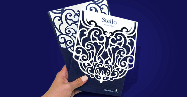
Premium uncoated papers provide a striking contrast to foil stamping, and they emboss beautifully, as they are capable of achieving great depth without cracking. Foil and embossing dies are limited in the amount of fine detail they can hold. It is best to avoid very fine or small type and detailed line motifs with limited space between lines. There are many embossing styles available, from simple bevels to sculptured embosses. Provide as much detail about dimensionality as possible when specifying embosses. Samples can be a very useful communication tool. For expediency, request that embossing/stamping proofs arrive before the job prints.