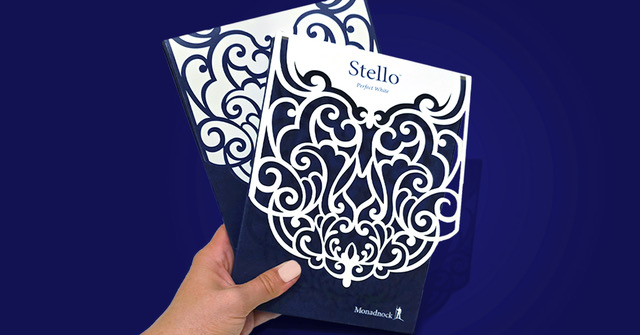
If you’re going to print something, print it beautifully. Every choice, from paper weight to finish shapes how a printed piece feels, engages, and communicates. Darcey Thompson, Director of Marketing and Creative at Southeastern Printing, shares insights on how selecting the right paperboard weight, folding and scoring techniques, and finishing options can transform a print piece into a powerful brand statement.
The Power of Paper Weight: First Impressions That Linger
Selecting the weight of paper for a print project isn’t just about function—it’s about creating a sensory experience that reinforces its message. It’s the heft of a direct mail piece that stops it from being discarded, the reassuring thickness of a brochure that conveys its importance, and the silky smoothness of a notecard that encourages recipients to hold onto it a little longer. Paper weight dictates the immediate sensory reaction, guiding both perception and behavior.
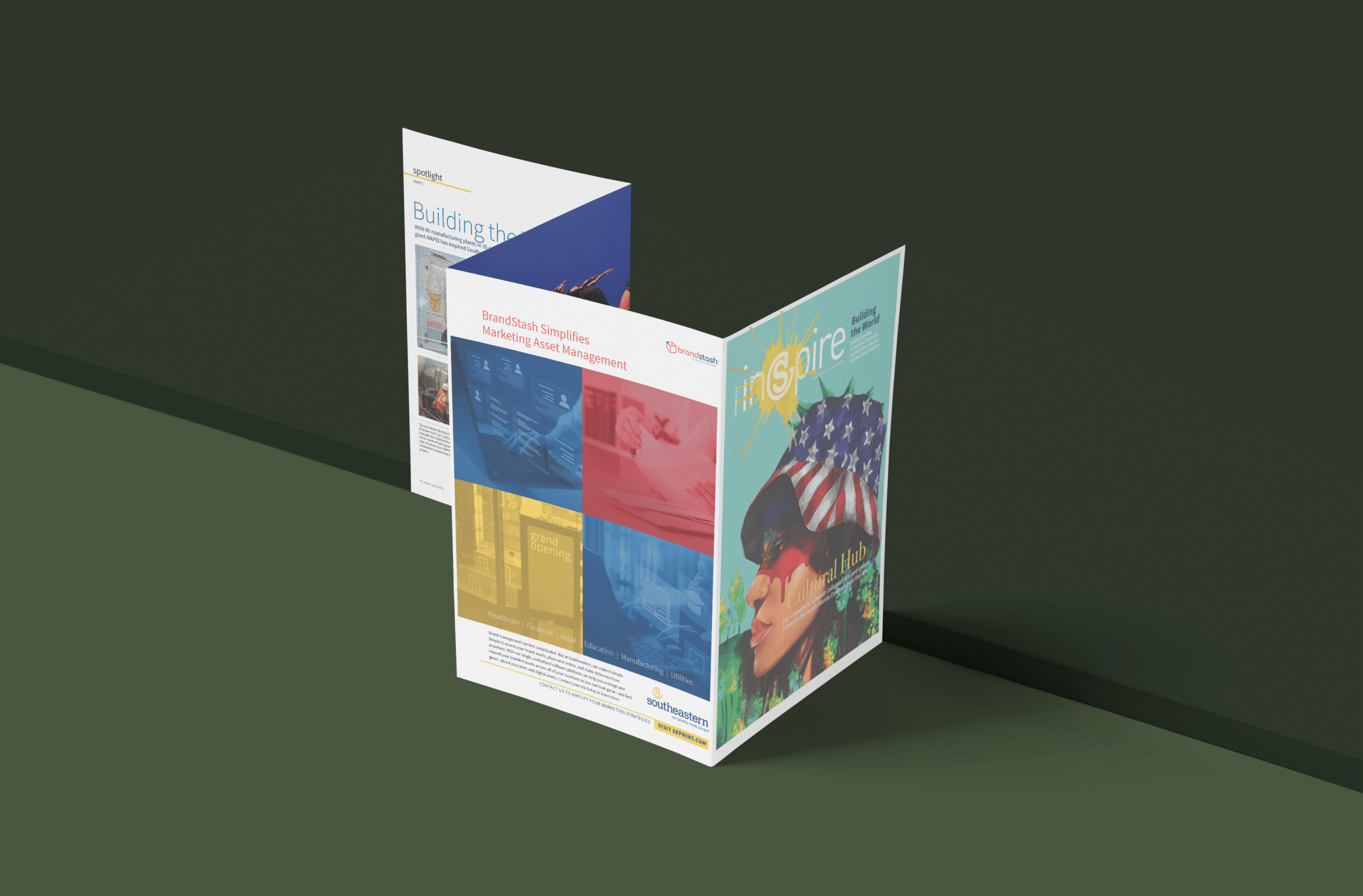
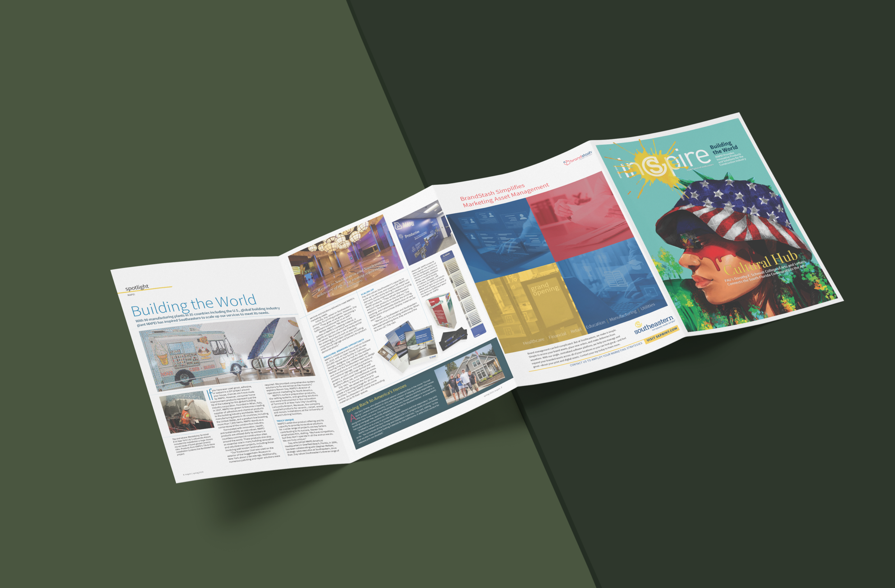
Southeastern’s Inspire newsletter is a testament to the impact of thoughtful paper choice. Printed on Monadnock’s 100% recycled Astrolite Velvet stock, the 16-page, W-fold newsletter is more than a simple communication tool; it’s an immersive, tactile narrative. The paper’s premium feel and carefully selected weight created an immediate sense of presence, inviting readers to slow down and engage more deeply with each page. It was designed to create a presence, embodying Southeastern’s dedication to quality and environmental responsibility.
Navigating the Technical Terrain: Folding, Scoring, and Finishing
Heavier paper brings a premium feel, but it can also introduce technical challenges. If the right steps aren’t taken, cracking at the fold, opacity issues, and ink bleed-through are common problems. Without proper scoring, folds on thicker paper can crack, and lighter stocks with heavy ink coverage risk bleed-through or reduced opacity. This is where true craftsmanship and meticulous attention to detail come into play.
“Paperweight impacts how a design translates in print, especially with thicker stocks,” Thompson explains. “Each fold has to be precise to avoid cracking; scoring must follow the grain to maintain structural integrity. These technicalities separate an average project from a flawless one.”
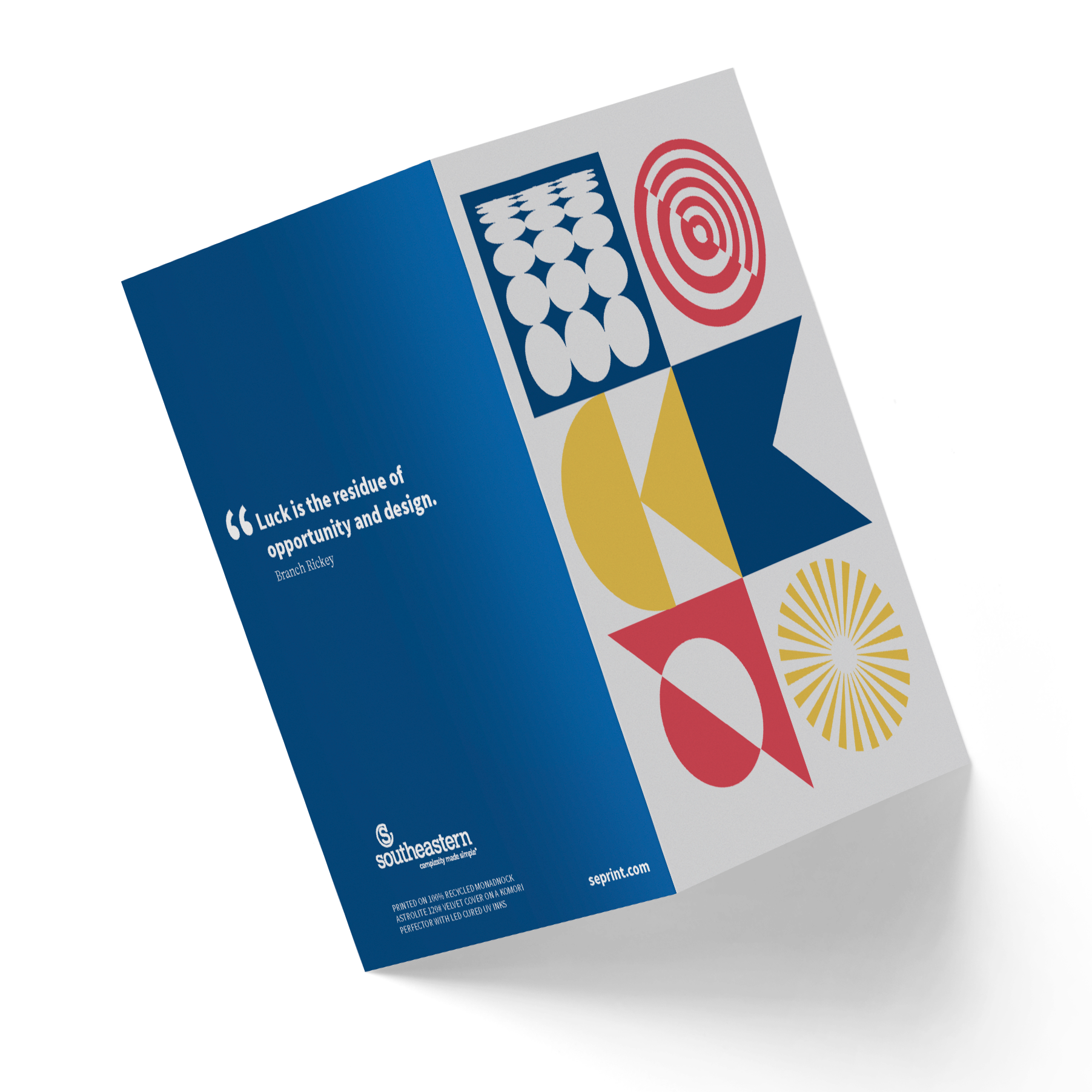
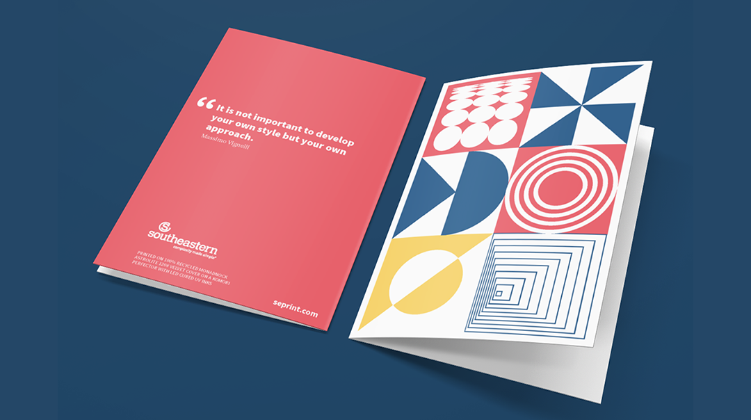
This attention to detail was essential in developing a Scandinavian-inspired notecard set for an industry event giveaway. The collectible set was printed on Monadnock’s Astrolite PC 100® Velvet—a 100% recycled, smooth stock that embodies Southeastern’s commitment to premium sustainable printing. Each 5×7, 120lb cover card featured a quote from a notable designer of the past. Paired with 70lb, A7 4/C envelopes and packaged beautifully in a 150lb cover folded-carton style box, the set reflected Southeastern’s legacy of aesthetics, responsibility, and technical excellence.
“We wanted to create something with impact,” explains Thompson “Astrolite Velvet provided the perfect balance of weight and finish, giving each card a timeless elegance.”

Beyond the Basics: Aligning Paper with Brand Identity
Paper weight directly influences how a brand is perceived. A substantial, heavier weight signals permanence and value, while a lighter stock may suit designs that evoke a sense of modern minimalism. It’s about creating the right sensory experience for your target audience.
For example, Southeastern Printing designed an identity package for a high-end Miami hotel, understanding that the finish of the paper stock would need to communicate understated luxury. “The paper’s soft finish and subtle texture were essential to achieving the refined aesthetic we envisioned,” says Thompson. “The hotel’s visual identity was clean and minimal, anchored by a single PMS color used throughout the property. We wanted the print materials to reflect that same simplicity, and this paper choice played a crucial role.” The result was a tangible expression of the brand’s identity, reinforcing its commitment to simplicity and elegance in a way that guests could see and feel.
Sustainable Choices, Without Sacrificing Quality
While every project is unique, there’s one thing many modern businesses have in common: sustainability priorities. Sustainability in print is no longer an afterthought—it’s a core expectation for many. But sustainability doesn’t have to mean sacrificing quality or the tactile experience. For many brands, sustainability is a core value that must shine through in their print materials. Monadnock’s Astrolite PC 100® Velvet, made from 100% recycled fiber, exemplifies this commitment, offering a premium look and feel without environmental compromise. By pairing this stock with LED-cured UV inks, Southeastern reduces energy use and resource consumption while preserving print quality.
“Sustainability has become a baseline requirement for our clients, and they want materials that convey premium quality while supporting their values,” says Lisa Lindblom at Southeastern. “It’s now more accessible than ever for our clients to achieve their goals for high-quality, sustainable print that aligns with their brand standards—and we’re proud to help them accomplish that. We align with their sustainability goals by choosing materials like Astrolite Velvet while providing a premium, tactile experience. Monadnock’s recycled stocks deliver on that promise, performing as beautifully as any virgin paper.”
The Future of Print: Where Innovation Meets Responsibility
As the demand for environmentally responsible print products grows, sustainable advancements in the industry continue to evolve. “We’re seeing a significant push toward adopting recycled and responsibly sourced paper, along with biodegradable coatings and eco-friendly inks,” Lindblom explains. “The growing desire for FSC®-certified paper options will likely push the industry toward more transparent, sustainable practices, meeting the consumer’s call for environmentally conscious choices.”
Digital printing is paving the way for customization with minimal waste, as on-demand production eliminates unnecessary overprinting and resources. These trends are opening new creative avenues. Techniques such as spot UV, embossing, and soft-touch laminates further expand the possibilities, empowering designers and printers to create truly immersive experiences while honoring sustainability commitments. These developments not only meet client expectations but also open creative possibilities for designers.
“The real innovation lies in combining the technical with the creative,” Thompson concludes. “When we match the right paper weight, finishing techniques, and sustainable practices, we’re creating a printed piece that resonates deeply with our clients and their audiences. Print, after all, is a medium that leaves a sensory impact, and there’s no digital substitute for the connection it creates.”
Elevate Your Brand, Sustainably
In print, every choice matters, and thoughtful design can elevate your brand while aligning with environmental values. At Southeastern and Monadnock, we believe that sustainability and quality go hand-in-hand. Whether it’s through selecting the ideal paper weight or implementing responsible printing practices, we’re here to help brands make a lasting impression.
